Use the Label Studio agent to create an Interface
You can create Interfaces in two ways:
Within Label Studio - Use Label Studio’s out-of-the-box Interface builder to prompt our agent to build and refine your Interface.
Developed locally - Install the
create-interface-skilland use an agent of your choice to vibe code an Interface that you can then import into Label Studio. For more information, see Develop an Interface locally.
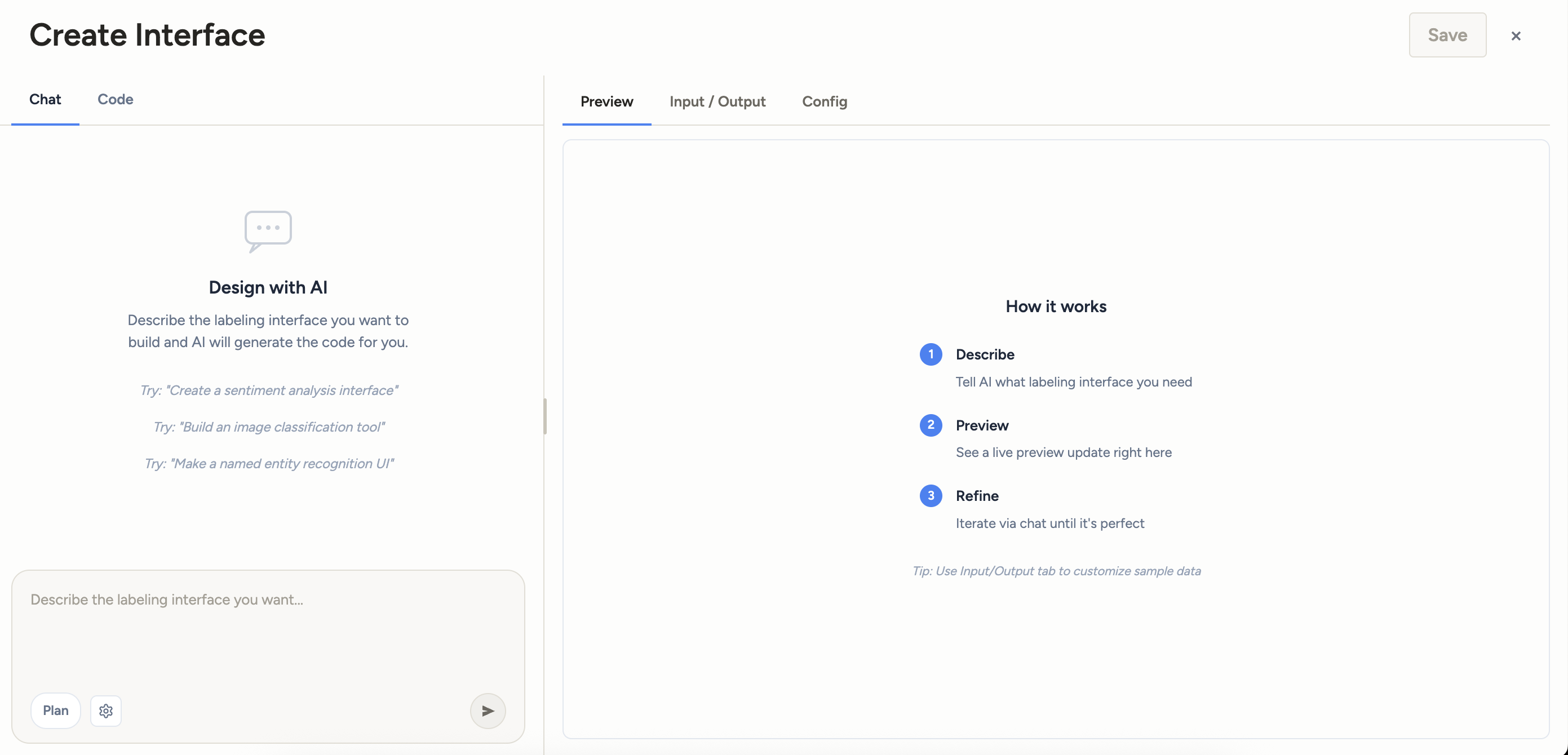
To begin, select Interfaces in the main menu and then select Create Interface > Create with Agent.
Tip
If you want to start from an existing labeling UI rather than a blank slate, select the overflow menu next to any Interface and select Duplicate. From here you can edit the copy.
The Interface builder is comprised of the following tabs:
| Tab | Description |
|---|---|
| Chat | Provide instructions to the Label Studio agent to build out your custom interface. |
| Code | View and manually update the React component created during your building session. |
| Version navigator | As you iterate on the interface via chat, you can navigate between versions of the preview. |
| Preview | An interactive preview of your interface. |
| Input/Output | Customize the input data you want to see in the preview, and see the output you would achieve as you interact with the preview. |
| Config | Once you have a basic version of the Interface built, you can use this tab to modify the interface rather than iterating through the chat. |
| Grid Cell | If you enabled Build custom grid view in the settings, this tab lists each grid cell. |
Chat
The Chat tab is where you collaborate with the agent to build the Interface.
In the message box at the bottom, describe the labeling UI you want. Be specific about:
- What the annotator should see (text, image, dialogue, side-by-side documents, etc.).
- What they are being asked to do (pick a label, highlight spans, fill a form, rank options).
- Any domain constraints (label names, required fields, rules).
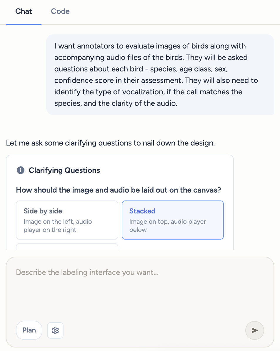
Plan mode
In Plan mode, the agent will surface:
- Question cards — Multiple-choice questions the agent uses to narrow the design. Click the options that apply and submit.
- A plan summary card — The proposed design. You can Approve it, Approve with edits (tweak the plan text first), or Revise (send feedback and let the agent propose again).
Once the plan is approved, the agent switches to code generation.
Settings
You can select whether you want to build a custom grid view for your Interface.
Grid view allows you add a custom summary that appears in the Data Manager when viewing tasks in Grid View. This summary can be edited when modifying the Interface from the project settings.
Code
The Code tab is where you can view and manually update the React component created during your building session.
Version navigator
As you update the Interface, the preview will update to reflect the changes. You can move between versions of the Interface using the controls above the chat panel:

Use this to:
- Step through every snapshot the agent has produced and every manual edit you’ve made.
- Roll the preview back to an earlier version if a later change broke something.
- Pick any earlier snapshot as the basis for the next prompt.
Tip
Versions you navigate to stay editable — you can keep refining from any point in history.
Preview
Every time the agent writes or edits code, the Preview on the right re-renders using the current sample task data. Click around in the preview exactly as a labeler would — if something looks wrong, describe the fix in chat and the agent will patch the code.
If the code has a syntax or runtime error, an error message appears in the preview pane so you know what’s broken.
Tip
As you interact with the preview, check the Input/Output tab to see a preview of the annotation output in JSON format. Ensure this matches what you would expect.
Input/Output
| Section | Description |
|---|---|
| Input | The input data that the Interface reads from. You can edit the example input to see how the Interface behaves against realistic data. |
| Output | The output data that the Interface produces. As you interact with the interface under the Preview tab, this section automatically updates to show the output in JSON format. |
Config
The Config tab allows you to adjust the Interface’s annotation controls. For example, you can add or delete choices, change the colors of labels, adjust the display text of labels, and more. The changes you make will be reflected in the preview and the code.
These values can also be updated in the Chat panel by describing the changes you want to make, and can also be updated later from the project settings.
Grid Cell
The Grid Cell tab only appears if you have enabled Build custom grid view in the settings. It lists each grid cell in the Interface.